
DAHLIA
logo / identity
Client: Dahlia Living | Role: Design, Art Direction
Dahlia Living is an assisted living facility in the Seattle area for adults with disabilities. They manage 4 homes in East King County and support 25+ adults. They needed an updated logo for their new name, Dahlia. I’m so grateful for the opportunity to collaborate with clients who do such passionate, loving, truly important work.
client desires:
- An updated logo that visually articulates comfort, hope, support, living alternatives
- Recognizable icon that can stand alone on elements.
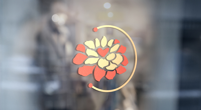
solution:
- The icon has an artistic, whimsical quality, while still maintaining simplicity in it’s overall appearance. Each petal is unique in shape, some with their own twisted edge – which represents the idea of uniqueness and a lot of “different” things coming together to create one beautiful flower full of life.
- The middle of the Dahlia is a subtle heart, which is a nod to the special work that the team does and love needed in this field of work.
- Overall aesthetic of freeness and fluidness, while also being contained which is a nod to the idea of ‘safety’ and clients being cared for and supported.
Ready to chat?
I am available for freelance and contract design work. My rates are negotiated hourly or by project.